Splits, accordions and sidebars
Containers that divide a window: panes with a draggable divider, sections that fold, a scrolling area with thin bars, a navigation sidebar that folds to an icon rail, and a docs style nav tree.
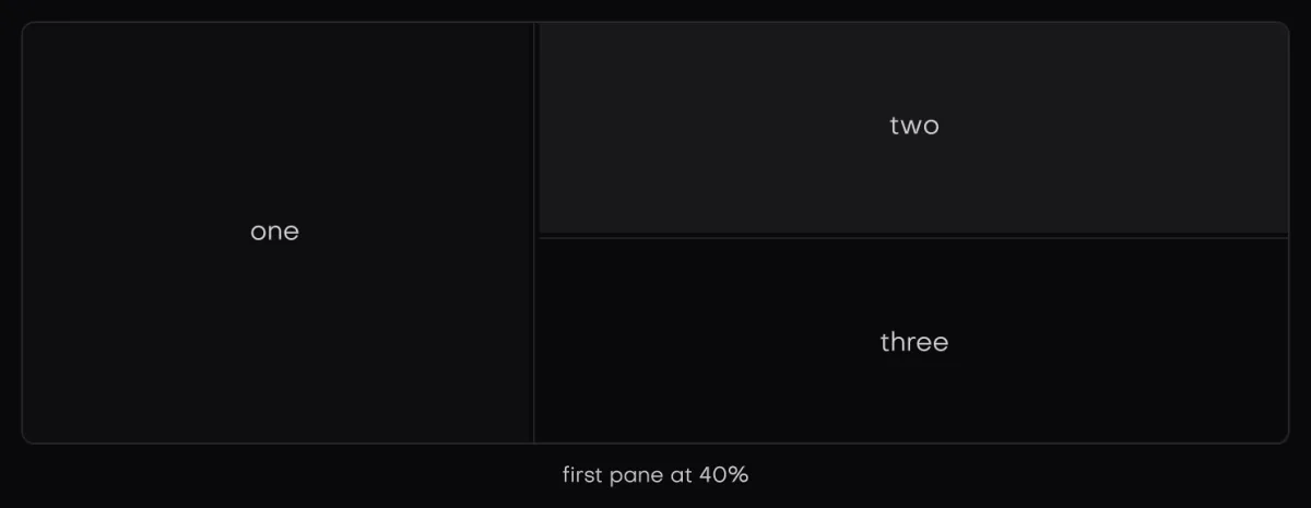
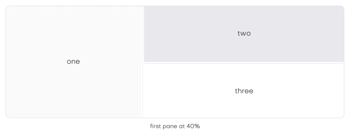
In the galleryResizableresizableAccordionaccordionScroll Areascroll_areaSidebarsidebar
They live in isolenui/kit/containers.h and come in through isolenui/kit/kit.h. As with the pagers, a *_begin that returns false has closed what it opened, so skip its end. One left open at the end of a frame is dropped with a warning.
#include "isolenui/ui/ui.h"
#include "isolenui/kit/kit.h"
struct editor {
bool folded = false;
uint32_t section = 1u;
float split = 0.3f;
uint64_t open = 1u;
};
static void editor_view(ui::ctx* u, editor* e, gfx_svg files_icon, gfx_svg search_icon)
{
ui_box(u, ui::row().grow())
{
// a navigation sidebar that folds to an icon rail
if (ui::sidebar_begin(u, "nav", ui::col().grow(), &e->folded, ui::sidebar())) {
ui::sidebar_toggle(u, &e->folded);
ui::sidebar_group(u, "workspace");
ui::sidebar_item(u, files_icon, "files", 1u, &e->section);
ui::sidebar_item(u, search_icon, "search", 2u, &e->section);
ui::sidebar_end(u);
}
// two panes, the app keeps the fraction, a double click folds the first
const ui::split_spec sp = ui::split().first(160.0f).second(240.0f).owned(&e->split);
if (ui::split_begin(u, "panes", ui::row().grow(), sp)) {
// the first pane, an accordion with one section open at a time
if (ui::accordion_begin(u, "outline", &e->open, true)) {
ui_accordion_item(u, "symbols") { ui::text(u, "main"); }
ui_accordion_item(u, "notes") { ui::text(u, "none yet"); }
ui::accordion_end(u);
}
ui::split_next(u);
// the second pane scrolls under thin themed bars
ui_scroll_area(u, "body", ui::col().grow().pad(12.0f))
{
for (uint32_t i = 0; i < 200u; ++i) {
ui::key(u, uint64_t(i));
ui::textf(u, ui::mono(u), "%4u line", i + 1u);
}
}
ui::split_end(u);
}
}
}split
split_begin(u, label, style, spec) opens the first pane. split_next closes it, places the divider and opens the second pane, and split_end closes the split. Skipping split_next leaves the second pane empty.
split_spec field | Chain | Default | Meaning |
|---|---|---|---|
stacked | column(on) | false | Panes top to bottom instead of side by side. |
start | at(f) | 0.5 | The first pane's share when the split is new. |
min_a, max_a | first(lo, hi) | 0, 0 | The first pane's limits in px. A zero max is no max. |
min_b | second(lo) | 0 | The second pane's minimum in px. |
handle | grip(px) | 6 | The divider's thickness. |
folds | foldable(on) | true | A double click or Enter on the divider folds the first pane away. |
fraction | owned(&f) | null | Your own share of the first pane, read and written by the split. Null keeps it in the split's state. |
The limits are turned into shares of the room the panes share, and the first pane never grows so far that the second loses its minimum plus the divider. ui::split() returns the defaults.
- Drag. The divider follows the pointer after 3 units of movement, clamped to the limits. Dragging a folded split unfolds it.
- Keys. The divider is a tab stop. The arrows along the split move it 8 units, or 64 with Shift. Home and End go to the limits, and Enter folds or unfolds.
- Fold. The first pane eases to nothing and back. The share is kept, so unfolding returns to it. Only a fold eases, a drag or a key follows at once.
- Look. The divider wears
role_grip, which never fills. At rest the gutter is clear. Hovered or focused it shows a thin rounded line centred on it and running along it, 2 units thick and 40 percent of the divider's length but at least 24, in the text colour at low strength, and while it is dragged the line turns the accent colour.
accordion
accordion_begin(u, label, &open, single) starts a stack of sections. accordion_item(u, title) declares a collapsible header and returns true while its body is to be declared. Close the body with accordion_item_end, or use ui_accordion_item, and finish with accordion_end.
openholds one bit per item in declaration order, so up to 64 items. Later ones stay shut with a warning. A nullopenkeeps the bits in the store for you.- With
single, opening one section closes the rest. If several bits are set on entry, only the lowest is kept. - A body eases open and shut toward the height its content had last frame. It is still declared while it closes, so
accordion_itemreturns true until it has shut. - The header is an ordinary
collapsible, a tab stop that toggles on a click, Enter or Space, with the docs style fold look: a small chevron that turns as it opens, no rules, and a hover fill. See collapsible. - An open body has a thin guide line in the theme's
rulecolour down its start edge, under the chevron, and its content is inset to line up under the header label. In right to left the chevron, the guide and the inset all mirror.
kit.conf: accordion needs collapsible.
scroll area
scroll_area_begin(u, label, style, bars) opens a view with thin bars over its content, and scroll_area_end closes it. ui_scroll_area(u, label, style) is the block form. An axis left visible in the style scrolls when it overflows, and an axis you set to hidden stays fixed. The bars are 8 units wide with a 24 unit minimum thumb and take no room. They wear the theme's role_scrollbar look, or the look you pass, which must outlive the frame. It is keyed by label, so scroll_to and scroll_of reach it. See overflow and views.
sidebar
sidebar_begin(u, label, style, &folded, spec) opens a navigation column. When folded is true it narrows to an icon rail, and its width eases between the two. Declare groups, items and a fold button inside it, then call sidebar_end. The sidebar does not place itself, so put it in a row beside your content.
sidebar_spec field | Chain | Default | Meaning |
|---|---|---|---|
width | wide(px) | 240 | The open width. |
rail | railed(px) | 56 | The folded width, where the icons sit. |
right | on_right(on) | false | The sidebar sits at the end of the row. The fold button aligns to the start and its chevron points the other way. |
The column is padded 8 units, clips sideways and scrolls down with thin bars. It fills with the theme's panel colour unless your style sets a fill.
sidebar_group(u, title)adds a gap and a caption heading, which fades out as the sidebar folds. Folded, it is a rule.sidebar_item(u, icon, label, id, &active)is one row wearingrole_nav_item. The icon sits in the rail's lane, or the label's first letter wheniconisGFX_NONE, and the label fades in beside it. The item withactive == idshows as checked. A click, Enter or Space writesidtoactiveand returns true on that frame. Folded, the label becomes a tooltip.- The items are one tab stop: the active item, or the first when none is active. Up and Down move between items and wrap round.
sidebar_toggle(u, &folded)is a chevron button that flipsfoldedand returns true when it does. It takes Enter and Space and has an expand or collapse tooltip.
nav tree
nav_group and nav_item build a navigation tree in the docs style, the look of the sidebar on this site: group headers that fold, and rows under them on a guide line. They lay out in whatever column you open, so they work inside a sidebar or on their own.
bool nav_group(ctx* u, const char* title, bool* open, uint32_t count = 0, bool count_open = false)is a header with the collapsible fold look that flips*openon a click, Enter or Space, and returns*open. Declare the group's items only while it returns true. A nonzerocountshows on the end side while the group is shut, andcount_openshows it while it is open too. A nullopenreturns false.bool nav_item(ctx* u, const char* label, const nav_item_spec& s = , bool* hovered = nullptr)is one row wearingrole_nav_item. It returns true when it is clicked or activated with Enter or Space, and each item is a tab stop.hovered, when given, is set to whether the pointer is over it.- The active item is marked with a short rounded accent bar on its start edge and the checked state of the look.
nav_item_spec field | Default | Meaning |
|---|---|---|
active | false | The current page. It gets the accent bar and the checked state. |
nested | true | Indented under a group, with the guide line down its start edge. False gives a top level row, such as a home link above the groups. |
muted | false | The label in the dim text colour, for an entry that is not ready. |
tag | null | Small muted text on the end side, such as a count or a word like new. |
host_hot | false | You walk a highlight yourself, as a search list does with the arrow keys, and hot replaces the pointer hover. |
hot | false | With host_hot, whether this row is the highlighted one. |
height | 0 | The row height. Zero takes the theme row_h less 4. |
Labels are one unit smaller than the theme text. In right to left the chevron, guide line, accent bar and tag all mirror.
#include "isolenui/ui/ui.h"
#include "isolenui/kit/kit.h"
struct docs_nav {
bool open[2] = { true, false };
uint32_t page = 0u;
};
static const char* const k_guides[] = { "overview", "layout", "styles" };
static const char* const k_kit[] = { "buttons", "menus", "charts", "chat" };
static void nav_tree(ui::ctx* u, docs_nav* n)
{
ui_box(u, ui::col().width(220.0f).gap(2.0f))
{
// a shut group shows its count beside the title
if (ui::nav_group(u, "guides", &n->open[0], 3u)) {
for (uint32_t i = 0; i < 3u; ++i) {
ui::nav_item_spec s;
s.active = n->page == i;
if (ui::nav_item(u, k_guides[i], s)) {
n->page = i;
}
}
}
if (ui::nav_group(u, "component kit", &n->open[1], 4u)) {
for (uint32_t i = 0; i < 4u; ++i) {
ui::nav_item_spec s;
s.active = n->page == 3u + i;
// a tag sits small and muted on the end side
s.tag = i == 3u ? "new" : nullptr;
if (ui::nav_item(u, k_kit[i], s)) {
n->page = 3u + i;
}
}
}
}
}Right to left
A side by side split in a right to left box puts the first pane on the right. Dragging reads the pointer along the reading direction, and Left and Right swap so the arrow toward the start shrinks the first pane. The sidebar's fold chevron points the other way, and its items put the icon lane on the right with the label aligned to it. See direction and bidi.
kit.conf line except the accordion, which pulls in collapsible. An app that never calls one links none of its code.