Popovers, dialogs and toasts
Content that floats over the tree: popovers, hover cards and tooltips on a trigger, modal dialogs, sheets and drawers over a scrim, and a stack of toasts.
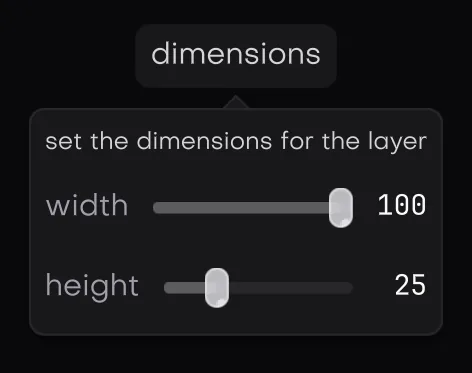
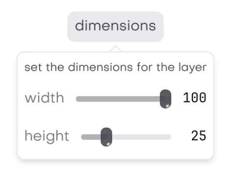
In the galleryPopoverpopoverHover Cardhover_cardTooltiptooltipDialogdialogAlert Dialogalert_dialogMessage Boxmessage_boxSheetsheetDrawerdrawerToasttoast
They live in isolenui/kit/menus.h and come in through isolenui/kit/kit.h, built on the core portals and modals. Each *_begin returns true while its content is to be declared. Pair it with its end only then.
Popovers
#include "isolenui/ui/ui.h"
#include "isolenui/kit/kit.h"
struct toolbar {
bool filters = false;
bool share = false;
bool dark = false;
};
static void tools(ui::ctx* u, toolbar* t)
{
// a button that toggles its own popover, focus goes in and comes back
if (ui::popover_button(u, "Filters", &t->filters)) {
ui::toggle(u, "dark only", &t->dark);
ui::popover_end(u);
}
// any trigger, here above it, tab kept inside and left open on an outside press
if (ui::button(u, "Share")) {
t->share = !t->share;
}
const uint64_t trigger = ui::last_id(u);
if (ui::popover_begin(u, trigger, &t->share, ui::side_top,
ui::popover_arrow | ui::popover_trap | ui::popover_sticky)) {
ui::text(u, "copy the link");
if (ui::button(u, "Done")) {
t->share = false;
}
ui::popover_end(u);
}
// plain text for the element just declared
ui::button(u, "Save");
ui::tooltip(u, "Save the deck, Ctrl+S");
// any content in the tooltip's place
ui::button(u, "Sync");
if (ui::tooltip_begin(u)) {
ui::text(u, "Last synced");
ui::text(u, "two minutes ago");
ui::tooltip_end(u);
}
// rich content that stays while the pointer is on the trigger or the card
ui::text(u, "@meowda");
if (ui::hover_card_begin(u)) {
ui::text(u, "owns the music visualizer");
ui::hover_card_end(u);
}
}popover
popover_begin(u, trigger, &open, at, flags) anchors a panel to the element trigger and returns true while open is set. Pair it with popover_end. The panel sits on the at side, side_bottom by default, centred on the trigger, moves to fit the view and fades in over 100 ms, easing out. The panel and its content fade together through style::opacity, text included. It closes at once when open goes false. The panel sits on elev_md, see shadows and elevation.
| Flag | Meaning |
|---|---|
popover_arrow | An arrow points at the trigger. On by default. |
popover_trap | Tab stays inside until it closes. |
popover_sticky | A press outside leaves it open. |
Escape sets open to false, and so does a press outside unless the popover is sticky. Focus goes in when it opens and back to the trigger when it closes, see focus. popover_button(u, label, &open, at, flags) declares a button that flips open on a press, Enter or Space, carries state_open, and returns what popover_begin returns.
hover card
hover_card_begin(u, open_delay, close_delay) hangs rich content on the element declared just before it. It shows after the pointer rests there for open_delay, 0.6 seconds by default, and stays while the pointer is on the trigger or the card. It goes close_delay after the pointer leaves both, 0.3 by default. The card sits centred below the trigger with an 8 unit gap, moves to fit and fades in over 100 ms, content included. Pair a true begin with hover_card_end. One hover card shows at a time.
tooltip
The tooltip moved from core to the kit and the call is unchanged. tooltip(u, text) shows plain text for the element declared just before it. tooltip_begin(u) takes any content in its place and returns true while shown. Pair it with tooltip_end.
- It shows after the pointer rests on the element for 0.45 seconds, never while a button is held down.
- It sits 14 units right of and 8 above the pointer, kept 4 units inside the view, and is drawn over everything.
- It fits its content up to 320 wide. The plain text is a caption wrapped to 6 lines.
- There is one hover timer, so one tooltip shows at a time.
- It fades in over 100 ms, easing out, each time it shows for a new element, and goes at once.
Modals
Dialogs, alert dialogs, message boxes, sheets and drawers are modals over a scrim in the theme's scrim colour. Focus stays inside while one is up. They all close on Escape by default. They open over 150 ms, easing out: the scrim fades in and the panel rises 12 units into place, or slides in from its edge for sheets and drawers. A close is instant. The panel and everything in it go on the first closing frame, and only the scrim fades out, over 100 ms, easing in. When open goes false the begin returns false at once, except for a drawer swiped shut, below. When the modal closes itself inside a frame, on Escape or a press outside, the begin still returns true that once, but inside an inert, disabled portal of no size, so nothing shows or fires. Panels sit on elev_lg unless the style names another lift. Up to 8 can stack.
#include "isolenui/ui/ui.h"
#include "isolenui/kit/kit.h"
struct modals {
bool rename = false;
bool remove = false;
bool unsaved = false;
bool settings = false;
bool share = false;
};
static void erase() {}
static void save() {}
static void dialogs(ui::ctx* u, modals* m)
{
// true while shown and while it fades out, then pair the end
if (ui::dialog_begin(u, "Rename", &m->rename, "Pick a new name for the deck.")) {
ui::text(u, "talk.deck");
if (ui::dialog_footer_begin(u)) {
if (ui::button(u, "Cancel")) {
m->rename = false;
}
if (ui::button_accent(u, "Rename")) {
m->rename = false;
}
ui::dialog_footer_end(u);
}
ui::dialog_end(u);
}
// only its buttons or escape close it, escape cancels
const int32_t r = ui::alert_dialog(u, "Delete deck?", "This cannot be undone.", &m->remove,
"Delete", "Cancel", true);
if (r == ui::alert_confirm) {
erase();
}
// the pressed button index, minus one on escape or the closer
static const char* const k_btns[] = { "Save", "Discard", "Cancel" };
if (ui::message_box(u, "Unsaved changes", "Save before closing?", k_btns, 3u,
&m->unsaved) == 0) {
save();
}
// a panel from the reading end of the view, 420 wide
if (ui::sheet_begin(u, "Settings", &m->settings, ui::side_end, 420.0f)) {
ui::text(u, "theme");
ui::sheet_end(u);
}
// a bottom panel, dragged down by its grip it closes
if (ui::drawer_begin(u, "Share", &m->share, "Send the deck to the stage machine.")) {
ui::text(u, "stage 1");
ui::drawer_end(u);
}
}dialog
dialog_begin(u, title, &open, description, flags, width) centres a panel 480 wide, or width, never wider than the view. The header shows the title, the description dimmed under it and a close button. Pair it with dialog_end.
| Flag | Meaning |
|---|---|
dialog_no_close | No close button in the header. |
dialog_sticky | A press on the scrim leaves it open. Escape still closes it. |
dialog_footer_begin and dialog_footer_end wrap a row of actions justified to the end, which wraps when narrow.
alert dialog
alert_dialog(u, title, description, &open, confirm, cancel, danger) asks one question in a panel 440 wide. It has no close button and a press outside does nothing. It returns alert_confirm or alert_cancel on the frame it is answered and alert_none otherwise. Escape answers alert_cancel. Any answer sets open to false.
- The buttons read Continue and Cancel by default. Cancel is autofocused.
- Confirm is an accent button, or wears
role_flat_dangerwhendangeris set. - For content between the header and the buttons, call
alert_dialog_begin, declare it, and finish withalert_dialog_end(u, confirm, cancel, danger), which returns the answer.
message box
message_box(u, title, body, buttons, count, &open, closer) shows a title, a body wrapped to 16 lines and a row of buttons in a panel 360 wide. Pressing a button closes it and returns that button's index. Escape, or the close button shown while closer is true, closes it with minus one.
- It holds at most 8 buttons. The first is autofocused, and Left and Right walk them along the reading direction.
- For your own labels per frame, call
message_box_begin, thenmessage_box_button(u, label)for each, true on its press, thenmessage_box_end, which returns the index pressed or minus one.
sheet
sheet_begin(u, title, &open, from, size, description) slides a panel in from an edge, side_right by default. Pair it with sheet_end. A press outside, Escape or the header's close button closes it.
- A side sheet takes the full height and
sizewide, 384 by default, capped at 75 percent of the view. - A top or bottom sheet takes the full width and fits its content, or takes
sizecapped at 90 percent. side_startandside_endfollow the reading direction.side_leftandside_rightstay where they are.
drawer
drawer_begin(u, title, &open, description) is a bottom panel with rounded top corners and a grip. Pair it with drawer_end. Dragging the grip or the title under it down past 30 percent of its height closes it, a shorter drag springs back, and an upward drag is damped to a fifth. A press outside or Escape also closes it.
A swipe that closes it keeps its momentum. The panel slides on down at the speed the finger had, or fast enough to leave in about 0.12 seconds if that is quicker, while the scrim fades out. For those frames open is already false but drawer_begin still returns true, so keep declaring the content and call drawer_end as usual. The panel is inert while it slides, so nothing in it takes a press. Once it is past its height the begin returns false. Opening it again mid slide stops the slide.
Toasts
toast(u, title, body, kind, seconds, action) queues a toast and returns its id. toaster(u, at) draws the stack. Declare it once a frame after the tree. It returns the id of the toast whose action button was pressed, or zero.
#include "isolenui/app/app.h"
#include "isolenui/kit/kit.h"
struct app {
uint32_t saved = 0u;
};
static void undo() {}
static void view(isolen_frame* f, void* user)
{
app* a = static_cast<app*>(user);
ui::ctx* u = f->ui;
ui_box(u, ui::col().grow().pad(24.0f).gap(12.0f))
{
if (ui::button(u, "Save")) {
a->saved = ui::toast(u, "Saved", "talk.deck is on disk", ui::toast_success, 4.0f, "Undo");
}
if (ui::button(u, "Offline")) {
// zero seconds keeps it until dismissed
ui::toast(u, "No network", nullptr, ui::toast_warning, 0.0f);
}
if (ui::button(u, "Clear")) {
ui::toast_dismiss(u, 0u);
}
}
// once a frame after the tree, the id whose action was pressed comes back
if (ui::toaster(u, ui::toast_bottom_right) == a->saved && a->saved) {
undo();
}
}
int main(int argc, char** argv)
{
static app s;
isolen_app_desc d = isolen_app_defaults();
d.title = "toasts";
d.view = view;
d.user = &s;
return isolen_run(&d, argc, argv);
}- Kinds.
toast_plainhas no mark.toast_info,toast_success,toast_warningandtoast_errorshow a dot in the theme'saccent,ok,warnorerrorcolour. - Time. A toast leaves after
seconds, 4 by default. Zero or fewer keeps it until it is dismissed. Timers pause while the stack is hovered, focused or dragged. - Stack. Toasts are 356 wide, 16 from the view's edge at one of six
toast_placecorners and centres. The newest 3 show, stacked with the ones behind peeking out and narrowing. Hovering or focusing the stack spreads it out. - Content. A bold title wrapped to 3 lines, a dim body wrapped to 6, an optional action button and a close button. Pressing the action dismisses the toast.
- Dismiss. The close button, a sideways swipe past 45 units, Escape while a toast holds focus, or
toast_dismiss(u, id). An id of zero dismisses every toast. - Keys. Alt+T focuses the front toast's first button.
- Motion. A toast fades and slides in over 150 ms, easing out, and leaves over 100 ms, easing in. A toast turned around midway picks up from where it was. Toasts sit on
elev_lg. - Limit. The queue holds 16, and a new toast past that drops the oldest with a warning.
toast_count counts the toasts not yet leaving, and toast_rect(u, id) gives where one landed last frame, empty once it is gone.
Right to left
A message box walks its buttons along the reading direction, and a sheet from side_start or side_end comes from the matching edge. See direction and bidi and menus for the rest of the group.
kit.conf line. An app that never calls one links none of its code.