Cards, alerts and display parts
Parts that mostly show things: cards, alerts, empty states, type styles, badges, key caps, separators, loading marks, avatars, breadcrumbs, pagination and a box that keeps its shape.
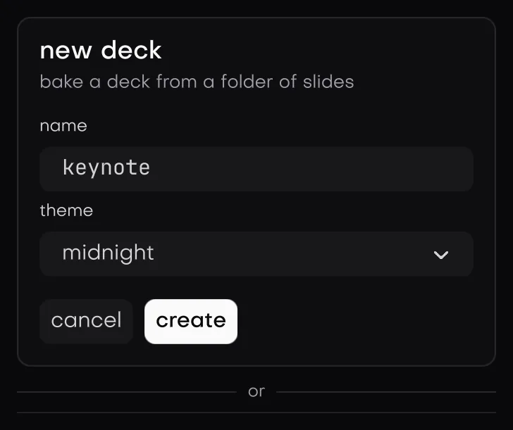
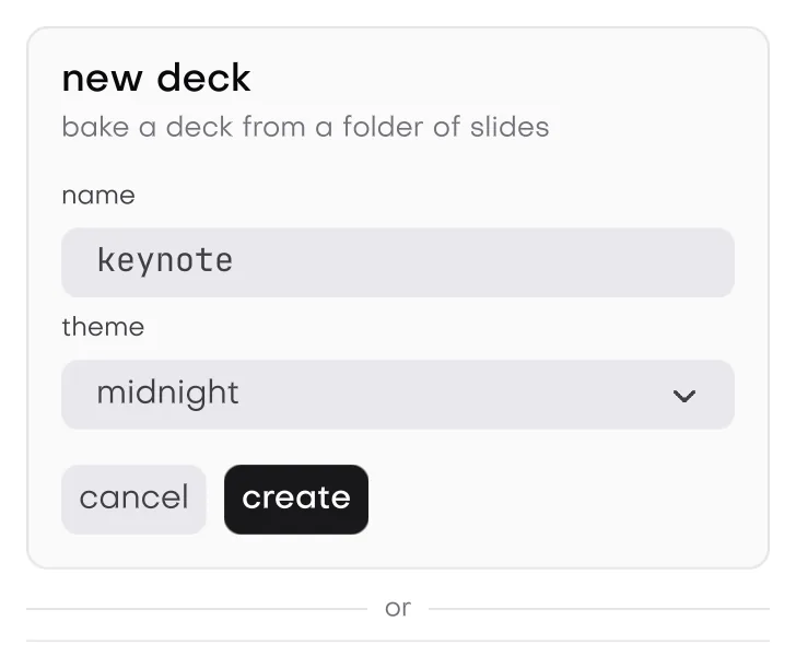
In the galleryCardcardAlertalertEmptyemptyTypographytypographyBadgebadgeKbdkbdSeparatorseparatorSkeletonskeletonSpinnerspinnerProgressprogressAvataravatarBreadcrumbbreadcrumbPaginationpaginationAspect Ratioaspect_ratio
They live in isolenui/kit/data.h and come in through isolenui/kit/kit.h. See the component kit.
#include "isolenui/ui/ui.h"
#include "isolenui/kit/kit.h"
#include <stdio.h>
struct account {
gfx_image photo;
uint32_t page;
uint32_t crumb;
float upload;
bool loading;
};
static const char* const trail[] = { "home", "projects", "isolen", "docs", "kit" };
static void profile(ui::ctx* u, account* a)
{
// a crumb before the last was picked, the middle folds past four
if (ui::breadcrumb(u, "path", trail, 5u, &a->crumb, 4u)) {
printf("go to %s\n", trail[a->crumb]);
}
ui_card(u, "profile", ui::col().width(320.0f))
{
ui::card_header(u, "profile", "how others see you");
ui_card_content(u)
{
if (a->loading) {
ui::skeleton_text(u, 3u);
} else {
ui::avatar(u, a->photo, "ada lovelace", 0.0f, false, ui::presence::online);
ui::text(u, "ada lovelace", ui::large(u));
ui::text(u, "writes the first program", ui::muted(u));
}
}
ui::separator(u);
ui_card_footer(u)
{
ui::badge(u, "admin", ui::tone::ok);
ui::kbd(u, "ctrl+shift+p");
ui::progress_ring(u, a->upload);
}
}
ui_alert(u, ui::tone::warn, GFX_NONE)
{
ui::text(u, "storage almost full", ui::h4(u));
ui::text(u, "old uploads go after thirty days", ui::lead(u));
}
if (ui::empty_state(u, GFX_NONE, "no projects", "start one to see it here", "new project")) {
printf("new project\n");
}
// sixteen by nine whatever the width, the content floats over it
ui_aspect(u, 16.0f / 9.0f, ui::col().bg("#202020"))
{
ui::spinner(u);
}
// pages count from zero, true when the page changed
if (ui::pagination(u, "results", &a->page, 40u)) {
printf("page %u\n", a->page + 1u);
}
}Every string these parts show is copied as it is declared, so a local buffer is fine for any of them.
Pairing
card_begin, card_content_begin, card_footer_begin, alert_begin, empty_begin and aspect_begin return true when there is a box to declare into. Call the matching end whatever they return: card_end, card_section_end for both sections, alert_end, empty_end and aspect_end. The ui_card, ui_card_content, ui_card_footer, ui_alert and ui_aspect block macros do this for you.
Typography
These return a text_style to pass to text or textf.
| Style | Size | Face | Colour | Wraps |
|---|---|---|---|---|
h1 | head_px times 1.5 | bold | text | no |
h2 | head_px times 1.25 | bold | text | no |
h3 | head_px | bold | text | no |
h4 | text_px times 1.18 | bold | text | no |
lead | text_px times 1.2 | ui | text_soft | yes |
large | text_px times 1.12 | bold | text | no |
muted | text_px times 0.85 | ui | text_dim | yes |
blockquote(u, text) is a 3 px bar in the rule colour beside wrapped soft text. inline_code(u, text) is a mono chip at 0.88 of text_px on the raised colour.
card
card_begin(u, label, style) opens a column. When the style sets none, it fills with the panel colour, draws a 1 px rule border and rounds by the theme radius. Inside:
card_header(u, title, description)is a padded column with the title inh4and the description inmuted. Either may be null.card_content_beginopens a padded column, andcard_footer_begina padded row with its items centred.
kit.conf: card needs typography.
alert
alert(u, tone, title, body, icon) is a row with a mark, a bold title and smaller wrapped body text. The title takes the tone colour, or text when neutral. alert_begin(u, tone, icon) draws the frame and the mark and opens a column for your own content.
The frame is the tone colour at 10 percent with a border at 45 percent. A neutral alert uses the panel and rule colours instead. With no icon the mark is a ring holding a tick for ok, x for error, ! for warn and i for the rest.
tone | Colour |
|---|---|
neutral | text_soft |
accent, info | accent |
ok | ok |
warn | warn |
error | error |
empty state
empty_state(u, icon, title, body, action) is a bordered, centred column with the icon on a 48 px disk, the title in h4 and the body in muted. It returns true when the action button is pressed. A null action shows no button. empty_begin(u, icon, title, body) opens a centred row under the text for your own buttons.
kit.conf: empty_state needs typography button.
badge, kbd and separator
badge(u, label, tone, outline)is a pillsmall_pxplus 9 tall. A tone fills at 18 percent with a stroke at 60 percent, andoutlinedrops the fill.neutralfills with the raised colour and a rule stroke. Thetonetype keeps it apart from the readoutsbadgethat takes an rgba colour.kbd(u, keys)splits on + and draws a key cap for each part, in small mono text. A + at the start or after another + is the plus key itself. Each part holds up to 31 bytes.separator(u)is a plain rule.separator(u, label)centres the label between two lines.
Loading marks
| Call | Default size | Motion |
|---|---|---|
skeleton(u, style) | the style, rounded by 0.6 of the theme radius when it sets none | A light band sweeps across every 1.6 s. |
skeleton_text(u, lines) | lines 0.8 of text_px tall, the last at 60 percent width | The same sweep. |
spinner(u, size) | 0.8 of row_h | 12 spokes step round 12 times a second. |
progress_indeterminate(u) | a 6 px bar across the row | An accent block slides across. |
progress_ring(u, fraction, size) | row_h | Below zero an arc spins with no value. Otherwise it fills to the fraction and does not move. |
Each asks for its next frame from inside its paint call, with redraw_after: the sweeps at 30 frames a second, the bar and the spinning ring at 60, and the spinner only at its next step. A mark that is scrolled away or culled is not painted, so it asks for nothing and the app can idle. See redraw.
avatar
avatar(u, img, name, size, square, presence) shows the image cropped to cover, or without one the upper cased first letters of the first and last words of name on the raised colour. The default size is 1.2 of row_h. It is round, or with square rounded by the theme radius up to a quarter of the size.
A presence other than none adds a dot at the bottom corner, ringed in the background colour: online in ok, away in warn, busy in error and offline in text_dim.
breadcrumb
breadcrumb(u, label, items, count, &picked, max_shown) draws each item as a flat button with a chevron after it, and the last as bold text. It returns true when an item before the last is clicked, or pressed with Enter or Space, and writes its index to picked.
When max_shown is 3 or more and count is larger, the middle folds into a ... button that keeps the first item and the last max_shown less 2. Pressing it unfolds the trail for good. Zero never folds.
pagination
pagination(u, label, &page, pages, siblings) counts pages from zero and shows them from 1. It returns true when page changed, and asks for a redraw. A page past the end is clamped.
- It shows the first page, the last, the current one and
siblingson each side, with ... where pages are hidden.siblingsis at most 12. When there are no more thansiblingstimes 2 plus 5 pages, all of them show. - Previous and next buttons sit at the ends and are disabled at the first and last page.
- With focus, Left and Right step a page, and Home and End go to the first and last.
- The current page has
role_tabandstate_checked.
aspect box
aspect_begin(u, ratio, style) opens a box whose height is its width over ratio, so 16 over 9 is wide. A ratio of zero or less counts as 1. The height is set in the same layout pass, and the content floats over the box at its full size and is clipped, so it never makes the box taller.
Right to left
None of these reads the direction. Cards, alerts, empty states, breadcrumbs, pagination and the rest are rows of boxes, so they follow the row mirroring in direction and bidi. The painted parts do not flip: the breadcrumb chevron points right, the pagination buttons keep their arrows, and Left always goes to the previous page.
card and empty_state need kit.conf lines. The rest link in on their own when an app calls them.