Focus, scopes and modals
One element holds keyboard focus. Tab walks an order you can shape, scopes hold focus inside a box while it is declared, and a modal is a scope that blocks everything behind it.
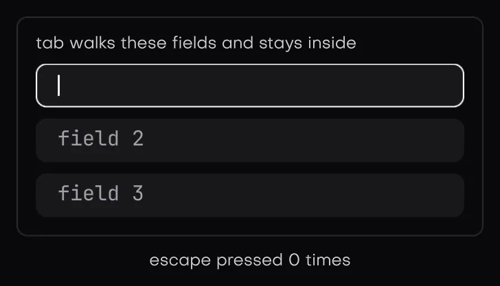
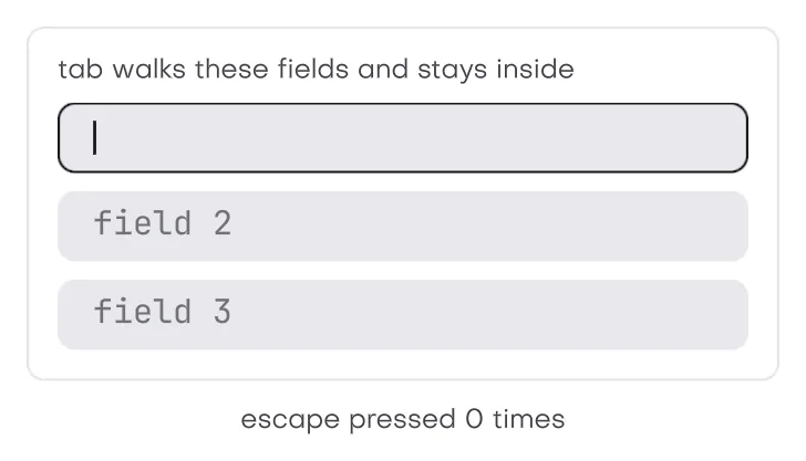
In the galleryFocus Scopefocus_scopeModalmodal
Reading and moving focus
ui::focus(u, id)moves focus from code. Zero clears it. A disabled element is refused and the refusal is logged.ui::focused(u, id)is true while that id holds focus, andui::focus_id(u)returns the id that does, or zero.ui::focus_visible(u, id)is true when that id is focused and the keyboard brought it there. Tab sets it, a pointer press clears it, and code keeps whatever the last input was. It is the only case a theme draws a focus ring for.
Tab order
ui::focusable(u, order) puts the element just declared into the tab order and returns true while it has focus. A disabled element does not join.
- Positive orders come first, lowest first. Order zero, the default, follows declaration order after them.
- A negative order is never reached by tab, only by a pointer press or by code.
- Tab moves forward and Shift Tab back, wrapping at both ends. Tab with Ctrl, Alt or Cmd held is left alone.
- While anything is focusable, the plain Tab key is taken by focus and never reaches the app.
A pointer press focuses the innermost element under it that joined with focusable, unless focus already sits on it or inside it, so a text box never bounces. A press on nothing focusable clears focus. Two calls change that for the element just declared:
ui::keep_focus(u): a press on it or inside it leaves focus where it is. Use it on a toolbar that acts on the focused field.ui::keep_tab(u): while it is focused, it takes a plain Tab next frame instead of losing focus. Shift Tab still leaves. The text edit core's tab flag relies on it.
Kit controls such as buttons, checkboxes and sliders join the tab order but are only reached by the keyboard. A press on them acts but does not focus them. Text fields join with focusable and take focus on a press.
#include "isolenui/ui/ui.h"
// a card the keyboard can reach, it draws its own edge when tab brought focus
static bool card(ui::ctx* u, const char* name, int32_t order)
{
const ui::theme* t = ui::theme_of(u);
ui::key(u, name);
// focus reads as of last frame, so the style can use it before the box opens
const bool ring = ui::focus_visible(u, ui::next_id(u));
bool has = false;
ui_box(u, ui::col().pad(12.0f).round(8.0f).bg(t->raised).border(2.0f, ring ? t->accent : ui::color(0u)))
{
// positive orders come first, zero follows declaration order
has = ui::focusable(u, order);
ui::text(u, name, ui::body(u));
}
return has;
}
struct player {
bool playing = false;
};
static void shortcuts(ui::ctx* u, player* p)
{
// a modal or any blocking scope holds the input, so app shortcuts wait
if (ui::captured(u)) {
return;
}
// keys a focused control claimed, and tabs focus moved on, are gone already
const ui::input* in = ui::input_of(u);
for (uint32_t i = 0; i < in->key_count; ++i) {
if (in->keys[i] == ui::vk::space) {
p->playing = !p->playing;
}
}
}Keys a focused control takes
A focused control takes the keys it handles before the app sees them. A focused button takes Enter and Space. A slider takes the arrows, Home, End and the page keys. A closed combo takes Enter, Space and Alt with the up or down arrow, and an open one takes Enter, up, down, Home, End and the page keys. Taken keys are removed from ui::input_of(u) and from isolen_frame::input, so an app shortcut on Space does not fire while a button is focused.
A key pressed with Ctrl or Cmd is never taken, so app shortcuts built on those always arrive. With Alt held, only up and down can be taken, and only by a control that asks for them with Alt.
ui::captured(u) is true while a blocking scope, such as a modal, is up. App shortcuts should wait while it is.
Focus scopes
ui::scope_begin(u, label, style, flags, events) opens a box that holds focus while it is declared, and ui::scope_end(u) closes it. They pair like open and close: call scope_end even when scope_begin returns false, which it does when the box was dropped. The label keys the box and may be null.
- On the first frame a scope is declared, focus goes to the element inside it marked with
ui::autofocus(u), or else to its first focusable in tab order. - When the scope stops being declared and focus died with it, focus goes back to where it was before the scope opened.
ui::scope_top(u)returns the id of the innermost open scope, or zero.- Up to 16 scopes can be open at once. Past that, a scope is dropped with a warning.
| Flag | Effect |
|---|---|
scope_trap | Tab and Shift Tab cycle inside the scope. A trap scope with nothing focusable clears focus when it opens. |
scope_block | Presses, double clicks, right clicks and the wheel outside the scope are dropped for everyone, and only the scope and scopes stacked above it hover. Focus that sits outside is pulled inside. |
scope_escape | The Escape key is reported to the innermost scope with this flag, and the app does not see it. The search stops at a blocking scope. |
scope_outside | A press outside the scope is reported. Scopes are asked from the innermost out, until one holds the press or a blocking scope is reached. |
scope_modal | scope_trap | scope_block. |
scope_events carries escape and outside. scope_begin fills it on the frame the key or press arrives, because focus reads input against last frame's tree. A press counts as inside when it lands on the scope, anything declared in it, a portal opened from it, or a region marked with ui::shield. The popover example closes a menu this way.
Modals
ui::modal_begin(u, label, style, open, flags) is a scope on a portal, so its style places it against the whole view wherever you declare it. Close it with ui::modal_end(u) only when it returned true, or use ui_modal(u, label, style, open, flags). It returns false when *open is false.
The flags default to scope_modal | scope_escape, so a modal traps, blocks and closes on Escape. Add scope_outside to close it on an outside press too, or pass plain scope_modal for one that only your own buttons close. On the frame it is dismissed, the modal clears *open and returns false. When the modal box is a full view scrim, every press lands inside it, so give it a cancel button or Escape rather than relying on outside presses.
ui::captured is for. The title bar is the exception: it lies outside the overlay area, so a press there is never held by a modal, never counts as an outside press, and leaves focus where it is.#include "isolenui/ui/ui.h"
#include "isolenui/kit/kit.h"
struct rename_dialog {
bool open = false;
char name[64] = "untitled";
};
static void rename(ui::ctx* u, rename_dialog* d)
{
const ui::theme* t = ui::theme_of(u);
// the modal box is a portal, so this scrim covers the view wherever it is declared
const ui::style scrim = ui::col().width(lay_pct(1.0f)).height(lay_pct(1.0f)).centre()
.bg(t->scrim);
// the default flags trap tab and block input, escape adds dismissal
ui_modal(u, "rename", scrim, &d->open, ui::scope_modal | ui::scope_escape)
{
ui_box(u, ui::col().width(320.0f).pad(t->pad).gap(t->gap).bg(t->panel)
.round(t->radius))
{
ui::text(u, "rename preset", ui::head(u));
ui::text_box(u, "name", d->name, sizeof(d->name));
// focus lands on the name field when the modal opens
ui::autofocus(u);
ui_box(u, ui::row().gap(t->gap))
{
ui::spacer(u);
if (ui::button(u, "cancel")) {
d->open = false;
}
if (ui::button_accent(u, "rename")) {
d->open = false;
}
}
}
}
}For component authors
This part is for code that builds a control, like the kit does. It lives in isolenui/ui/ui_focus.h, which is not an app header.
ui::focus_control(u, order, claims) joins the tab order like focusable, but a pointer press never focuses it, and the keys named in claims go to it alone while it holds focus. ui::focus_claims(u, id, claims) changes the claims of an element already joined this frame, as the combo does when its list opens. The control then reads its keys with focus_keys.
| Claim | Keys |
|---|---|
claim_enter | Enter |
claim_space | Space |
claim_x | Left and right |
claim_y | Up and down |
claim_ends | Home and End |
claim_pages | Page Up and Page Down |
claim_alt_y | Up and down with Alt held |
#include "isolenui/ui/ui.h"
#include "isolenui/ui/ui_focus.h"
// a component that tab reaches and that owns left and right while focused
static bool balance(ui::ctx* u, const char* label, float* pan)
{
ui::key(u, label);
bool changed = false;
ui_box(u, ui::row().height(28.0f).width(160.0f).as(ui::role_slider))
{
ui::focus_control(u, 0, ui::claim_x);
const uint32_t* keys = nullptr;
const uint8_t* mods = nullptr;
const uint32_t n = ui::focus_keys(u, ui::last_id(u), &keys, &mods);
for (uint32_t i = 0; i < n; ++i) {
const float step = keys[i] == ui::vk::left ? -0.1f : keys[i] == ui::vk::right ? 0.1f : 0.0f;
if (step != 0.0f) {
*pan = *pan + step < -1.0f ? -1.0f : (*pan + step > 1.0f ? 1.0f : *pan + step);
changed = true;
}
}
ui::textf(u, ui::caption(u), "%s %.1f", label, double(*pan));
}
return changed;
}