Groups, toggles and button matrices
Grouped choices from isolenui/kit/inputs.h: checkbox and radio groups, a switch with sizes and a note, toggle buttons, and the button matrix that button groups, toggle groups and the on screen keyboard are built on.
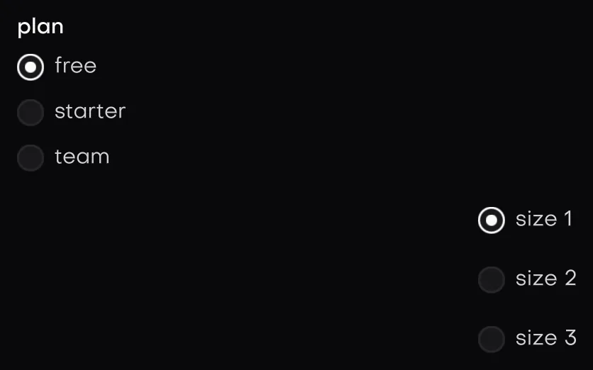
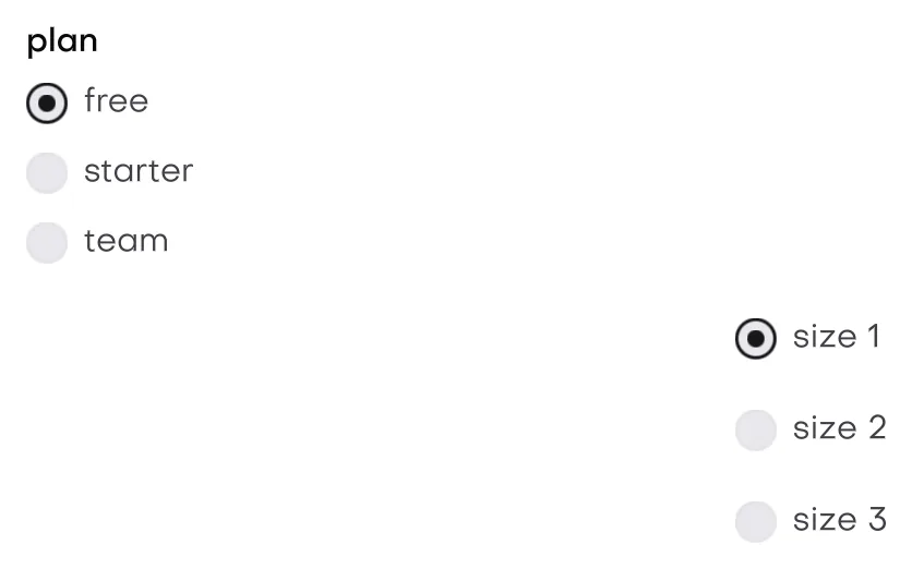
In the galleryRadio Groupradio_groupSwitchswitchToggletoggleToggle Grouptoggle_groupButton Groupbutton_groupButton Matrixbutton_matrix
#include "isolenui/ui/ui.h"
#include "isolenui/kit/kit.h"
struct prefs {
bool toppings[3] = { true, false, true };
uint32_t size = 1;
bool dark = false;
bool bold = false;
uint32_t align = 0;
uint64_t styles = 0;
uint16_t pad[6] = { 0, 0, 0, 0, 0, 0 };
};
static void choices(ui::ctx* u, prefs* p)
{
// a parent box that shows mixed while only some are ticked
static const char* const toppings[] = { "cheese", "olives", "basil" };
ui::checkbox_group(u, "toppings", toppings, 3u, p->toppings);
// one tab stop, arrows walk the options and wrap
static const char* const sizes[] = { "small", "medium", "large" };
ui::radio_group(u, "size", sizes, 3u, &p->size, true);
ui::switch_ex(u, "dark mode", &p->dark, ui::switch_of().about("follows the theme").sized(ui::switch_large));
// attached buttons, returns the one clicked or matrix_none
static const char* const edit[] = { "undo", "redo", "clear" };
const uint32_t hit = ui::button_group(u, "edit", edit, 3u);
if (hit == 2u) {
p->styles = 0;
}
ui::toggle_button(u, "bold", &p->bold);
static const char* const aligns[] = { "left", "centre", "right" };
ui::toggle_group(u, "align", aligns, 3u, &p->align);
static const char* const marks[] = { "italic", "underline", "strike" };
ui::toggle_group_multi(u, "marks", marks, 3u, &p->styles);
// a keypad, a lone newline starts a row, del repeats while held
static const char* const keys[] = { "7", "8", "9", "\n", "4", "5", "del" };
p->pad[5] = uint16_t(ui::cell_repeat | 1u);
ui::matrix_spec m = {};
m.map = keys;
m.count = 7u;
m.ctrl = p->pad;
ui::matrix_out out;
ui::matrix(u, "keypad", m, &out);
}Checkbox groups and mixed state
checkbox_mixed(u, label, &state) is a checkbox over a check_state: check_off, check_on or check_mixed. A press or space turns on off, turns off on, and turns mixed on. It returns true when the value changed.
checkbox_group(u, label, items, count, values) puts a parent checkbox over one checkbox per item, indented under it. The parent reads mixed while only some children are on. A press on the parent sets every child to match it. It returns true when any value changed. Each box is its own tab stop and takes space.
Radio groups
radio_group(u, label, items, count, &value, across) writes the picked index. The label is a bold legend above. across lays the radios out in a row that wraps, and otherwise they stack. The group is one tab stop, on the picked radio. The arrows walk every option and wrap at both ends, and space picks. It returns true when the value changed.
Switches
switch_ex(u, label, &value, spec) is the toggle switch with more options. It takes a press or space and returns true when the value flipped. Build the spec with switch_of(), which is switch_normal with the label leading:
about(text)adds a wrapped note under the label.sized(s)picksswitch_small,switch_normalorswitch_large, drawn at 0.8, 1 or 1.25 times the normal size.first()puts the switch before the label.
Toggle buttons
toggle_button(u, label, &pressed)stays pressed until pressed again. It takes enter and space, turns bold while pressed, and returns true when it flipped.toggle_group(u, label, items, count, &index, flags)keeps at most one pressed. Pressing the pressed one again lets go, andindexbecomesmatrix_none. It returns true on any press.toggle_group_multi(u, label, items, count, &mask, flags)presses any number: bitiis itemi, up to 64 items. Bits above the item count are kept. It returns true when the mask changed.
Both groups default to matrix_attached and always fit their labels. More than 64 items are cut to 64 with a warning. Pressed buttons wear the theme's toggle look.
Button groups
button_group(u, label, items, count, flags) is a row of attached buttons sized to their labels. It returns the index clicked this frame, or matrix_none. The flags are matrix flags, and matrix_attached | matrix_fit are always added.
The button matrix
matrix(u, label, spec, &out) draws a grid of buttons as one element with one tab stop. It returns the button fired this frame, or matrix_none.
| matrix_spec | Meaning |
|---|---|
map, count | Labels in reading order. An entry that is a lone "\n" starts the next row. Up to 16 rows and 128 buttons, and past that the rest are left out with a warning. |
ctrl | One uint16_t per button, not per map entry. matrix_buttons(map, count) says how many. Null gives every button width one and no flags. Checked bits are written back. |
flags | Matrix flags, below. |
row_h, gap | Zero takes the theme row height and half the theme gap. Attached matrices have no gap. |
| cell_flag | Effect |
|---|---|
cell_width | The low four bits: the button's width in units against the others on its row. Zero counts as one. |
cell_hidden, cell_disabled | Neither can be pressed or reached by the arrows. |
cell_checkable, cell_checked | Firing a checkable button flips its checked bit. |
cell_accent | The primary look, for an enter key or a default action. |
cell_repeat | Fires on press, then again after 0.45 s and every 0.06 s while held. It wakes itself with redraw_after. |
| matrix_flag | Effect |
|---|---|
matrix_one_check | Checking one button clears the rest, like radios. |
matrix_attached | Buttons touch and share borders inside one frame. |
matrix_no_wrap | The arrows stop at the ends instead of wrapping. |
matrix_fit | Buttons take the width of their labels, and the matrix hugs them. Otherwise it grows to fill. |
matrix_no_focus | Out of the tab order, so only the pointer reaches it. |
A plain button fires when released over the button it was pressed on. With focus the matrix claims the arrows, home, end, enter and space. Left and right walk buttons in reading order, up and down move to the nearest button on the next row, home and end go to the ends of the row, and enter or space fire the button with the ring. matrix_out carries fired, held, the ring's focus, and changed when a checked bit moved. matrix_cell(u, id, spec, button) returns where a button landed last frame, to hang a popover off it.
kit.conf
No lines are needed. The groups call checkbox.cpp, radio.cpp and matrix.cpp directly. See the component kit, and buttons and choices for the single controls.